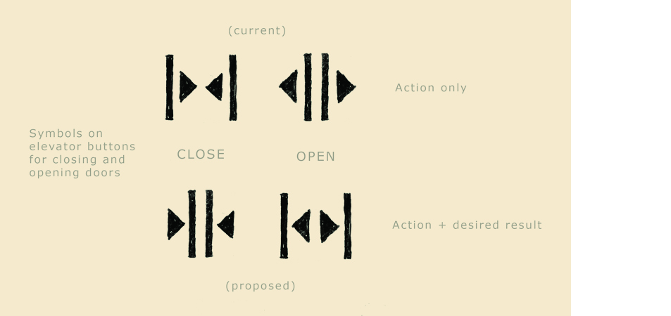
For a long time it has bothered me that the "open" and "close" buttons on elevators are so counter intuitive. I will invariably push the wrong button when someone yells "hold the elevator", so when I examined the symbols more closely it became apparent why: they have it wrong.
I sketched out the elements, rearranged them and viola! As they now exist the symbols only address the desired action; the change I propose addresses both the action and the desired result, making them much more intuitive.
I find it hard to believe that I am the only person that this has bothered, but then again people do say that I'm a little weird. I recognize the resistance to change by an entire industry, but isn't that what graphic design is all about: finding the best way to communicate? It is our civic duty; how many more people have to miss the elevator before we do something?! A better world is within our grasp; spread the word!